
What Do You Do When Your Data Is Wrong?
It is better to be directionally correct with clear caveats than precisely wrong with none

Early post in honor of those taking Good Friday off tomorrow.
*******
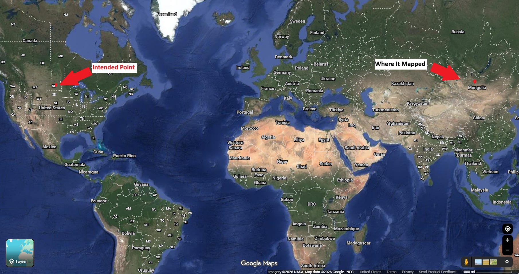
I was mapping soil sample data for a farm in the Midwest when one of the fields showed up in Mongolia, just outside Ulaanbaatar.
As cool as it would be to have Mongolian soil data, I don’t.
That is not the kind of error you can wave away. It’s not GPS inaccuracy or rounding drift.
It’s the mistake that forces you to stop and ask whether the system you are relying on deserves your trust at all.
The dataset itself looked serious.
It contained lab measurements for bulk density, soil mass, timestamps, and location fields, each record carrying dozens of attributes.
At first glance, it felt structured enough to analyze. But once I started to work through it carefully, it became clear that some of the records had issues.
Even just a percent error rate is small enough to ignore if you are careless and large enough to break your conclusions if you are not.
The real danger is not bad data by itself. The real danger is clean-looking analysis built on top of it.
When the numbers line up neatly, when the charts render without errors, and when the outputs feel precise, it becomes very easy to mistake measurement for truth.
That is a trap I have written about before in the context of performance marketing, where clean dashboards often hide flawed assumptions and overconfidence in the underlying data
Why Data Alone Is Useless: How to Create Insights Instead of Trash

“It’s currently 29” the screen’s red lights show
The question is not whether your data is perfect. It never is. The question is what you do the moment you realize it is not.
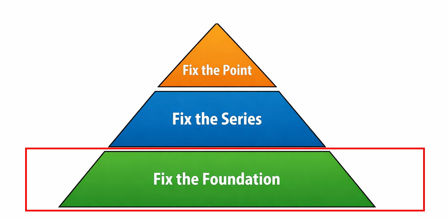
The Three-Step Fix
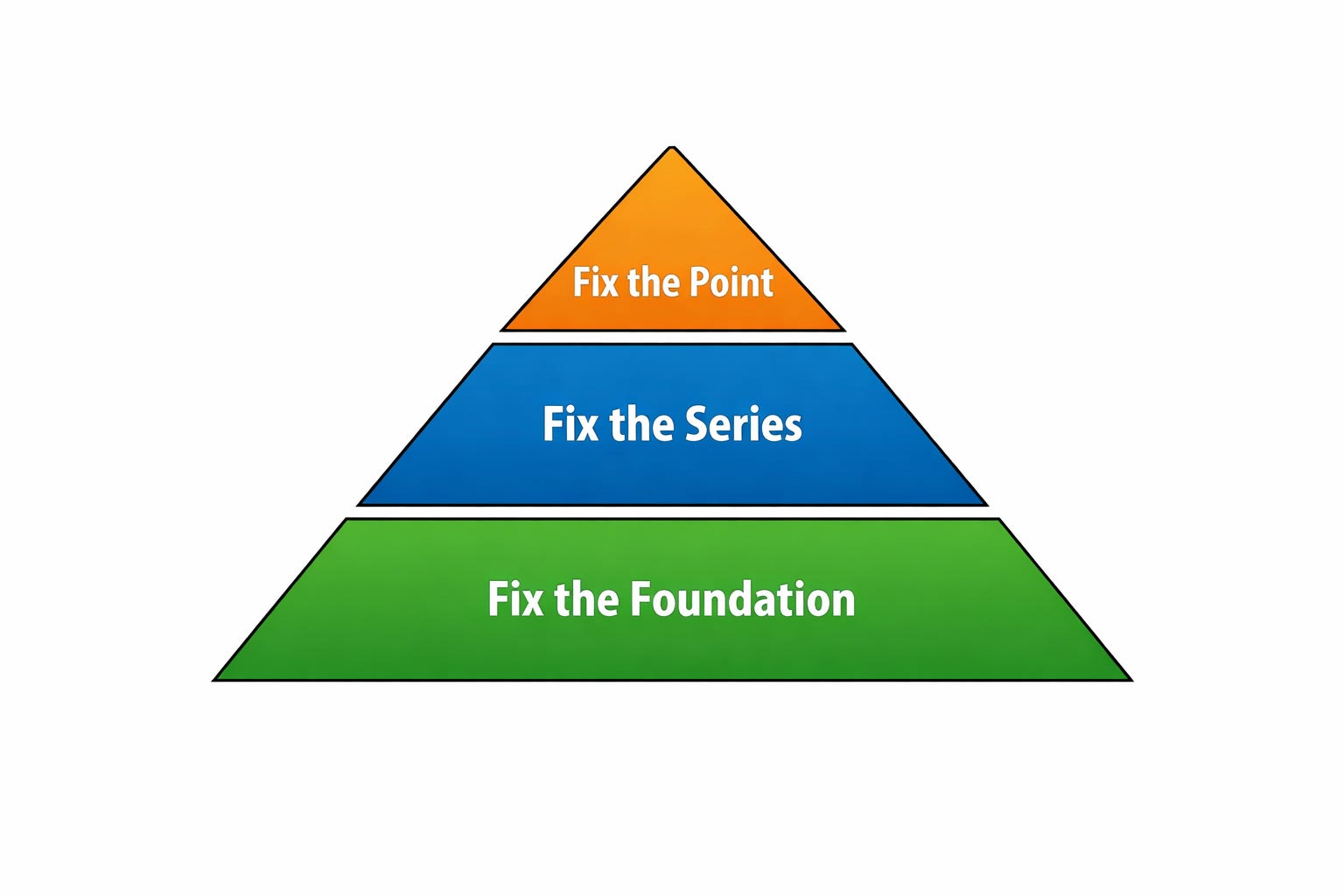
When your data is wrong, there are three levels at which you need to respond.
You fix the point. (Easy)
You fix the series. (Medium)
You fix the foundation. (Hard)
Most teams stop after fixing a few bad rows because it feels like progress. It is visible, immediate, and easy to explain. But unless you address the process that produced those errors and the structure that allowed them to persist, you are not solving the problem, you’re resetting the clock.
First, You Have to Stop
Before you touch a single record, you need to pause long enough to understand what you are seeing. This is the part that gets skipped most often, especially in environments where speed is rewarded and uncertainty is uncomfortable.
Someone notices an outlier, shrugs, and continues. Someone else smooths it out, assuming it will average away. A report gets built anyway because the deadline is closer than the root cause.
That instinct is understandable.
It’s also wrong.
Bad data is not the problem. Acting on bad data is the problem. Once you build on top of something flawed, the issue compounds. A single incorrect record becomes a skewed distribution. That distribution becomes a misleading trend. That trend becomes a confident recommendation.
If something does not make sense, it is not an inconvenience. It’s still telling your something.
What “Wrong” Actually Looks Like
In this dataset, the errors were not subtle if you knew where to look.
There were coordinates that placed Midwestern farm plots in Mongolia. There were clusters where nineteen samples sat within a tight radius and one was miles away. Dates appeared in unnatural patterns, with an odd concentration on January 1st. A few soil values drifted outside what is physically possible.
More importantly, the errors were not random.
They clustered by person.
One agronomist (sorry Stephen) consistently produced strong field insights but introduced more inconsistencies during data entry.
That pattern matters because it tells you that the issue is not statistical noise. It is process-driven. Most data problems are not technical at their root; they are human, and they reflect the systems we build around those humans.
You Have Seen This Before
If you work in marketing or operations, this pattern should feel familiar.
These are not insights. They are artifacts.
In one dataset, the value “999” was used to represent “never contacted.” It shows up as a number, but it does not behave like one. It dominates the distribution and masks the real patterns underneath it
This is the same failure mode I’ve written about elsewhere: numbers are treated as objective truth simply because they are numeric, even when they are proxies, placeholders, or side effects of a system that was never designed for analysis in the first place.
Step 1: Fix the Point
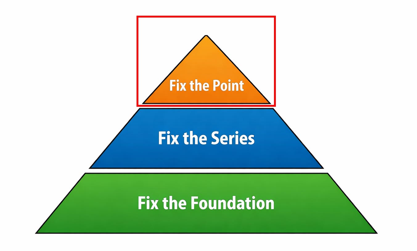
The first level of response is local. You examine individual records and decide what to do with them.
The key is to approach this carefully, because it is easy to introduce new errors while trying to remove old ones.
Each questionable value falls into one of three categories: something you can fix, something you can flag, or something you should leave alone.
If you can verify the correct value, you should fix it. A coordinate that is off by a sign is often recoverable. A sample that sits far outside a cluster may indicate swapped fields or a simple entry mistake. When you have enough context to be confident, correction is appropriate.
If you suspect a problem but cannot confirm it, then the right move is to flag it. That preserves the data while making its uncertainty visible to anyone who uses it later.
If you do not know the correct value, then leaving it blank is often the best option. This is where many datasets get worse during “cleaning.” Missing values are replaced with zeros or placeholders that look legitimate but are not.
If zero is a valid value elsewhere, you have now created ambiguity where none existed before. DONT DO THIS!
That is exactly how placeholder values like “999” become dangerous. They begin as a practical encoding of missingness and end up being treated as real data, distorting analysis in subtle but meaningful ways
Alongside these decisions, you should apply basic sanity checks.
Physical systems have limits. Geography has boundaries. Time has structure. When a value violates those constraints, it should not quietly pass through your pipeline.
Looking at distributions is often the fastest way to catch these issues. Spikes at round numbers, unnatural clustering, or tails that do not match real-world behavior are rarely random. They are usually signs of defaults, artifacts, or systematic entry errors.
Interpolation can be useful when you need continuity, but it comes with responsibility. Any inferred value should be clearly marked as such and, ideally, stored separately from observed data. Blurring that line makes it harder to reason about what is real and what is constructed.
Step 2: Fix the Series
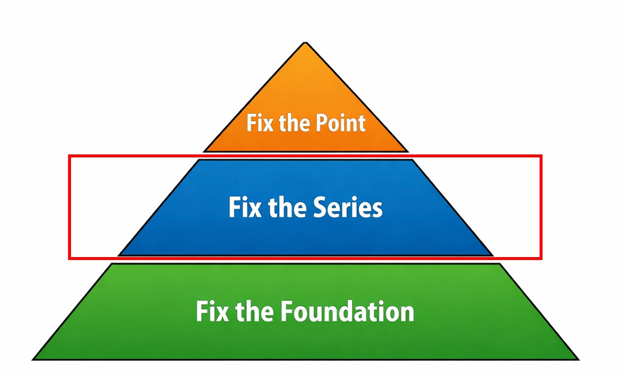
Fixing individual records is necessary, but it is not sufficient. If you stop there, the same errors will continue to appear.
This step requires shifting your focus from data points to processes.
In this case, the causes were clear. Data was entered manually. Excel was used as a primary tool. Validation was minimal.
Whatever—the
Each of those choices introduces flexibility, and flexibility without guardrails produces inconsistency.
The goal is to reduce the opportunity for error.
That can mean replacing free text fields with structured inputs, enforcing validation rules at the point of entry, or capturing certain values automatically rather than relying on manual input. If a device can record location data, there is no reason to trust someone to type it in.
Patterns like errors clustering by person are especially useful here. They reveal that the system depends too heavily on individual discipline.
A well-designed system should make it easy to do the right thing and difficult to do the wrong thing.
In Toyota Production System, this is known as a Poka Yoke

This is the same principle that shows up in more complex systems as well.
Most failures in modern martech are not due to lack of capability but lack of structure. Tools can do almost anything in isolation, but without consistent interfaces and standards, they become brittle and hard to trust

Step 3: Fix the Foundation
The final step is the most strategic and the least commonly addressed. It involves designing your data environment so that it can withstand errors and still produce reliable insight.
At its core, this means asking whether important information can be recovered if something goes wrong. If a field is critical and there is only one way to capture it, then any mistake in that process becomes permanent.
A more resilient approach is to build redundancy into the system.
In the soil dataset, farmer enrollment data provided a geographic boundary that could be used to validate sample locations. Clustering of nearby samples offered additional context. These are forms of indirect validation that make the system more robust.
You can extend this further. Capturing images at sampling points would allow for later verification. Storing raw lab outputs alongside processed values would preserve a ground truth reference. Each additional signal increases your ability to detect and correct issues after the fact.
It is tempting to view redundancy as waste, especially when optimizing for speed or cost—As if compute redundancy is your biggest barrier to productivity. But systems that optimize too aggressively for efficiency often remove the very safeguards that keep them stable.
Storage has become extremely cheap in the past decades. Business mistakes have not dropped in cost.
This is the same dynamic seen in broader marketing systems,
where over-optimization can degrade long-term performance by stripping away the underlying structure that supports growth

Bringing It Back to Martech
All of this applies directly to marketing and operational data.
Customer records contain duplicates and placeholders. Attribution models rely on incomplete signals. Dashboards present clean numbers that often obscure messy realities.
The pattern is consistent. When something looks precise, it is easy to trust it. When it is easy to trust it, it is rarely questioned.
That is why this framework matters. Fixing individual records is not enough. Fixing the process without addressing the structure is not enough. You need all three layers working together if you want your system to produce something you can rely on.
What Failure Actually Looks Like
Bad data is1 inevitable. It is a byproduct of real-world systems interacting with imperfect inputs and human behavior.
The failure is not in its existence. The failure is in the response.
Ignoring inconsistencies because they are inconvenient leads to brittle analysis. Freezing when uncertainty appears leads to stagnation. Presenting results you do not trust leads to poor decisions that carry real consequences.
A better standard is to treat uncertainty as part of the work. If something cannot be resolved, it should be acknowledged.
If a dataset has limitations, those limitations should be understood and communicated.
It is better to be directionally correct with clear caveats than precisely wrong with none.
A Simple Place to Start
If there is one practical step to take from this, it is this:
Choose a dataset you rely on
Find one value that does not make sense
Follow it back to its source
Understand how it got there.
Make a hypothesis for future data in that series
Test it over time
That process will teach you more about your system than any dashboard ever will.
Because the goal is not just to clean your data. The goal is to build a system that you can trust (even when it breaks).
I know its technically ‘are’, but thats not how normal people speak.