How Not to Do Data Visualizations
A Hate Letter to the Pie Chart
The CEO for a headache medicine company wanted to find new ways to grow.
The company already had the lion’s share of the market, but he wasn’t willing to become complacent.
Confident that the medicine was the best, he had their scientists send off samples of their product to a 3rd-party lab.
He was hoping to see blockbuster results that would clearly show that their medicine was the most effective.
Instead, he got..nothing.
The 3rd-party lab ran their tests—couldn’t find a difference between any of the medicines.
They ran their tests again—still no differences.
Right as the CEO was planning on hiring another lab to re-test the medicine yet again, the Head of Marketing stopped him.
“Don’t worry about the results. They’re actually a blessing.”
“How could you see these numbers as good?”
“Because they gave us our next campaign”
Verified by 3rd-Party labs: No product is better than ours
Data Visualization Primer
Data visualizations are great.
Instead of having to:
Read tabular data 🤮
OR
Shake hands with a robot and receive a serialized string of electrical pulses 💡
You can just look at a picture to learn what you need to know.
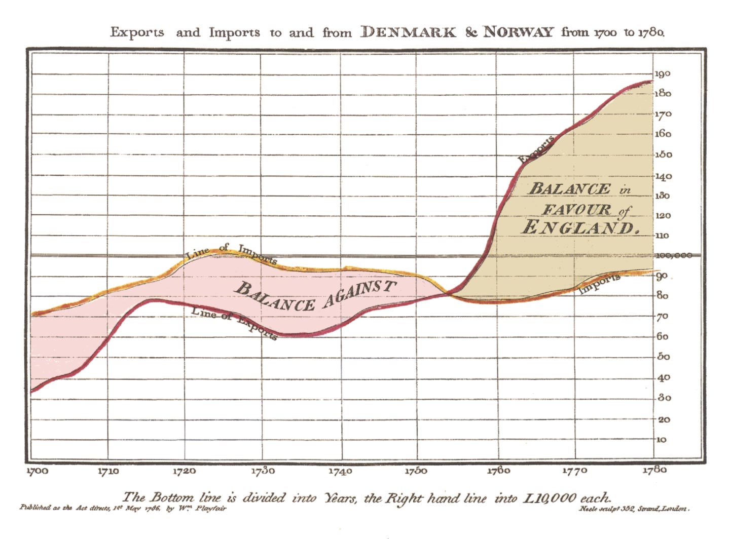
Well before computers were able to digitally create visualizations on-the-fly, people created useful visualizations to understand data.
For very formal analysis, illustrations could be made to showcase the meaning of tabulated date.1 William Playfair, an 18th century engineer and political economist used visualizations to bring people around to his point of view.
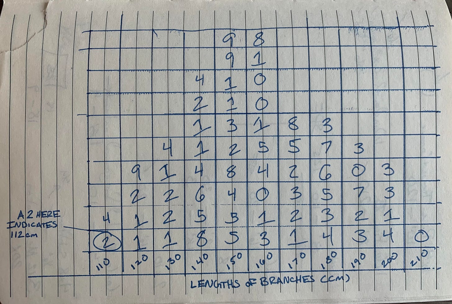
For less formal analysis, numbers could be recorded from natural observations in formats that begin to reveal trends through the number of records.
As an example below, I’ve recorded what an arborist might find when surveying trees in an area. There are no digital tools or fancy art techniques used to produce this visualization. Even so, the beginnings of a bell curve centered around 150cm already appear.
This incredible technology allows records to come to life in a way they never do in tabular format.
But now that you’ve heard me heap praise on data visualizations for their positive impact, I hate to admit: They’re a double edged sword.
Why I Hate the Pie Chart
“There are three kinds of lies: lies, damned lies, and statistics.”
—Mark Twain’s Autobiography
Visualizations’ ability to quickly convey information is also the same weakness that allows people to quickly lie with statistics.
There is a nearly 70 year-old book “How to Lie with Statistics” that is still full of great lessons.
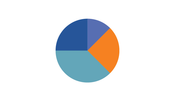
For one example, take the common & uninformative Pie Chart.
The Pie Chart is my least favorite visualization.
Not only does the chart make it hard to tell what a slice’s relative size is, but when more than a few categories are compared, the chart becomes a spinning ball of death.


Additionally, pie charts only can visually show you what makes up the whole. They can’t tell you about the size of the whole.2
The Lies Begin
Imagine you’re working with a company that helps you manage your many Quick Service Restaurant (QSR) sandwich shops.
You provide the capital for them to distribute and operate your restaurants. Each quarter they provide a report on how your sales were per store.
With Q1 and Q2 in the mirror, a quick glance at the graph in your quarterly report lets you feel good that shop 4 (recovering from a former bad manager) is actually making some gains!
You close the report and go about your day, futzing with a few low priority items you’d been putting off now that you have some free time.
What you didn't know is that the sales between these two graphs had fallen 89%. Seriously, the numbers in the backend to render these graphs3 are actually off by a factor of nearly 10.
By choosing to render changes over time in this way, your manager lied to you about the massive decline in sales that threatens your very business.
You paid your manager for terrible business management and didn’t even realize it.
How Can You Find The Lie?
Now that you know how easy it is to get fooled by visualizations, here is a heuristic approach to make sure you’re not getting fooled by the most common actors in misleading charts.
Like a 1950s soda shop, you should look for MALT.
Measured Variables
What is actually being measured?
If not the direct variable, is it a good proxy?
What changes might have occurred to make this proxy fit closer or father to the goal variable over time?
Axes Continuity & Endpoints
Are the axes endpoints chosen intentionally to make a change look larger or smaller than it is?
Do things have unusual scale breaks to minimize differences?
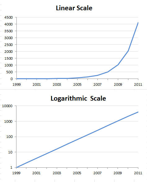
Logarithmic Scales
Are scales logarithmic? Does it make sense for them to be that way?
Are both X and Y axes log scales? Only one? Why would the author choose that?
Total Numbers, Proportions, or Earlier Comparisons
Are values being calculated as totals or changes from some earlier value? (e.g. US Inflation is a Year-Over-Year change, not absolute)
If changes from an earlier baseline, why was that value chosen? Was the value a normal instance or an unusual case that could hide larger changes?
Is the graphic showing total numbers or just proportions? Is that reasonable in context?
Order your MALT
When you’re looking at a graphic, remember to check the 4 common misrepresentations we discussed in this graphic.
Don’t be misled, order your MALT and know instead.
Edward Tufte has nominated Charles Joseph Minard's 1869 graphic of Napoleonic France's invasion of Russia as one of the best visualizations of all time. This is also from a time far before computers.
Yes, technically, you could sum all the numbers for each slice and sum them, but that negates the point of a visualization.
They’re actually this ugly be default. I didn’t change anything but the quick format to show percentages.


