
Is Your Mental Model of Data Wrong? How AI-Misinformation on Data Can Lead You Astray
The continuum-ization of the popular mind has some weird effects

In the past, people viewed data as parts of life’s story: separate, clear pieces of information.
It seemed ridiculous to look at the geese flying overhead and think:
I saw 12 geese. Concrete, real 👍🦆
vs.
The average number of geese that have passed is 13.234 per day in the last 2 years. Abstraction, what?! 👎
Farmers measured harvests in specific amounts based on each season. The idea of using a continuous distribution to understand discreet harvests would be alien1.
 — DoingData")
Like many innovations, plotting real data points onto a continuous distribution seems obvious in retrospect.
This way of thinking changed dramatically with the introduction of concepts like the bell curve and the Central Limit Theorem (CLT).
Probability theory showed that when we gather enough data, it often forms a continuous pattern.
Over time, businesses began using continuous data visualizations, like line charts (rather than scatterplots), to represent their metrics.
While continuous data visualization is a useful data lens, an over-reliance on it in the era of AI can obscure important real-life insights.
The Impact of AI and Machine Learning
Today, with the rise of AI and machine learning, we see another shift in how we handle data—Now you can just ask a question and get an answer.
Thats great for the lay-person, but these tools obscure the discrete nature of data.
For instance, if a company looks at a set of performance metrics and sees a trend going up, managers might jump to conclusions based on that small sample.
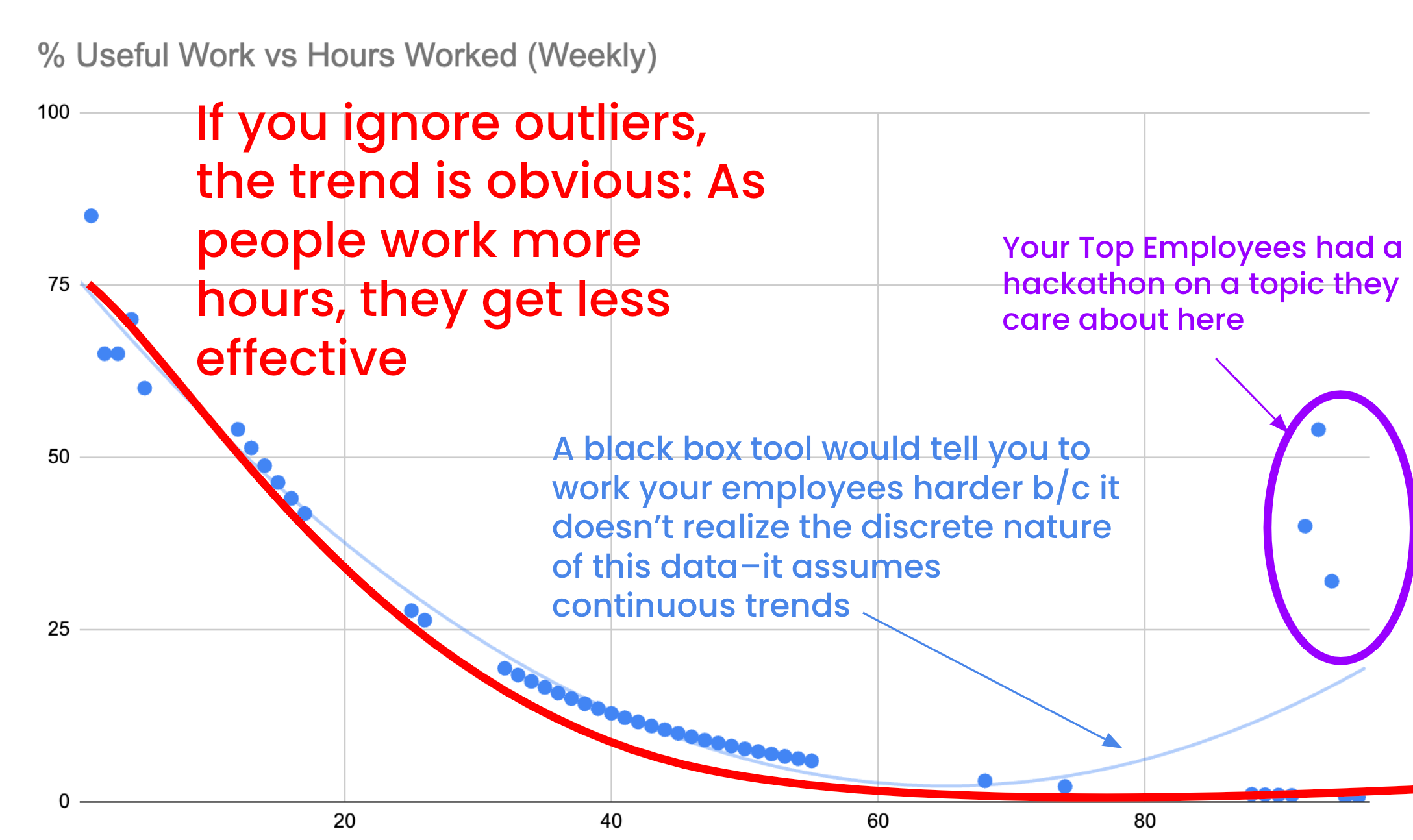
They might ignore important real-life details, like when a key employee worked a to to put on a conference he cared about, or when the workload shifted due to a water main breaking in the office.
This example above would tell you that employees trend towards being more productive after 80 hours of work in a week.
Instead of understanding the unique context and adjusting their understanding, an AI-misinformed manager may decide to reduce staff, thinking it will improve efficiency.2 This would lead to overwork, burnout, and high turnover.
Tools like polynomial fit lines in Excel can create curves that do not reflect the true nature of the data.
These visualizations can mislead managers into believing there is a trend when, in fact, the underlying data points tell a different story.

When we rely too heavily on these continuous representations, we risk making decisions that do not consider the reality of individual data points.
Continuous distributions can help us make good predictions, but they can also lead us astray.
Understanding Data’s Discrete Nature
Marketers need to help their teams and stakeholders see the nuances of data.
Every measurement is just a stand-in for a more complex reality.
Even simple things!
Your height, measured at the doctor’s office can be influenced by a lot: the doctor’s position relative to the ruler, your hairstyle, or even how long you were in bed the night before.

If you had a short haircut and a tall doctor one year, then a big hairstyle and short doctor the next—you might get a 1/2” swing in measured height. If we extrapolate that, you could be 10 feet tall by the time you retire!

Believing we can analyze data with perfect accuracy leads to overconfidence and poor decision-making.
When teams rely only on continuous data interpretations, they may miss outliers or unique cases that are essential for understanding performance.3
What Do I Do About This?
Look Inside Yourself: Could there be examples where you make projections based on data that isn’t all that continuous? Do you have models or dashboards that hide what the data really look like?
Know Your Limits!: Marketers should teach their teams about the limits of data. Help your team understand that measurements are not always exact and that each data point has its context. Keeping a written ‘comments’ column for data that’s gathered occasionally can help explain if something is a trend or a extrapolation artifact.
Add Context When Storytelling: When presenting data, it’s important to tell the full story. Explain why numbers change and highlight any events that might have influenced those changes. For example, if sales drop in a particular month, it’s essential to mention if there was a major holiday or if a competitor launched a new product.
Use Diverse Visualizations: Use different types of graphs to show both discrete and continuous data. Bar charts can highlight specific events or outliers, while line charts can show overall trends. Make a note somewhere about why you picked that visualization. The stock market with a ton of high-fidelity data? Makes sense for a line chart.
Foster Critical Thinking: Encourage a culture where your team members question assumptions (yes, even yours). Urge them to think critically about the factors that might explain trends or changes. For instance, if a marketing campaign did not perform as expected, ask what external influences, like economic shifts or seasonality, might have played a role.
A ‘failure’ can be a great learning experience! Don’t be afraid
Promote Iterative Analysis: Encourage teams to revisit and update their data insights regularly. This iterative approach allows them to adapt to new information and refine their strategies based on the latest context, rather than relying on outdated assumptions.
Note: Keep track of each guess though—even if you update an assumption, it’s good to review the average directions your predictions move. Are there sales people that always overestimate close probability? That’s good to know when budgeting.4
Implications for Marketing Strategy
The implications of how you think of data affect marketing strategy.
Understanding the discrete nature of data can lead to better decision-making.
By recognizing that every data point is influenced by specific circumstances, marketers can develop more realistic strategies. This could mean adjusting campaigns based on real-time feedback5 or reallocating resources in response to specific trends.
Additionally, embracing the complexity of data can help prevent burnout among team members.
When teams understand the context behind performance metrics, they are less likely to make rash decisions that could negatively impact morale.
Also, they know that their job is actually tough. Reality bends to no one’s will. Nothing is harder than a job you think should be easy pushing the limits of your patience.
Conclusion
As AI and machine learning continue to shape how we use data, it is vital to understand both the discrete and continuous aspects of information.
Encourage a deeper understanding of data for you and your team. You’ll be able to make more informed decisions that reflect the real world, and be happier when you struggle too.
See Ivan Illich
Line go up?
“But Ward!” You may argue, “reality actually is continuous. Why would we treat measurements as discrete”.
That’s not an unreasonable belief. Funny enough though, that’s the same feeling and arguments we had in the early 20th century in physics.
The shift from classical mechanics to quantum mechanics revealed that reality is often more complex and discrete than we once thought—but not without a lot of doubt and complaining from those used to continuous fields.
From Benn Stancil’s Substack: “Sales reps, it turns out, aren’t reliable forecasters of their own deals. Some are chronically optimistic.8 Some sandbag. Some miss telltale signs that a deal is about to fall apart. So, sales managers will often make their own adjustments, based on what they know about the rep and the deal. They’ll manually tinker with things
And recording the directions adjustments are made!