Advice on Creating a Sales Funnel
Excerpts From The Fastest Sales Funnel I've Ever Seen
You might try to read dry statistics about marketing, if you’re much like me.
Holding my eyes open as I read about various “revenue-based attribution models1” becomes harder every second.
Sure, the numbers say that adding another channel increases the ROI of both. Sure, I’ll memorize that result. Yep, it sounds right that moving from one channel to three is the equivalent of….Yeah..I have that in my brain, for sure.
But what about when you experience something instead of reading it?
The world is changed. The light behind your eyes returns with a powerful vigor. Memorization to understanding—the transition happens in a flash.
Instead of prying something from the dark, cavernous maw of memory, you feel it in your bones.
That’s how I felt recently running across a 2-channel marketing combination of some of the best hard-sell copy I’ve ever seen.
The product was a marketing book called “Sell Like Crazy”—here’s how it was positioned.
Quick Note: I haven’t purchased this book, so I can’t attest that its quality is on par with the rest of the sales funnel.
It started with a YouTube ad—that was catchy enough I didn’t skip
Crafting a YouTube ad compelling enough to avoid the skip is hard.

If 9 of every 10 viewers—and the 10th probably isn’t paying attention—skip video advertisements in 6 seconds, how do you sell?
You have to resonate with a very specific audience.
And I mean VERY SPECIFIC.
For video ads especially, don’t target “Middle-aged buyers with a household income >$100k”. Target “upper-middle class suburban mothers in the Southwest who are worried about getting a healthy meal on the table for their kids after getting home from work”.
With only a few seconds to keep attention, you need to slam your value prop into the timeslot. You can’t; not with general banalities.
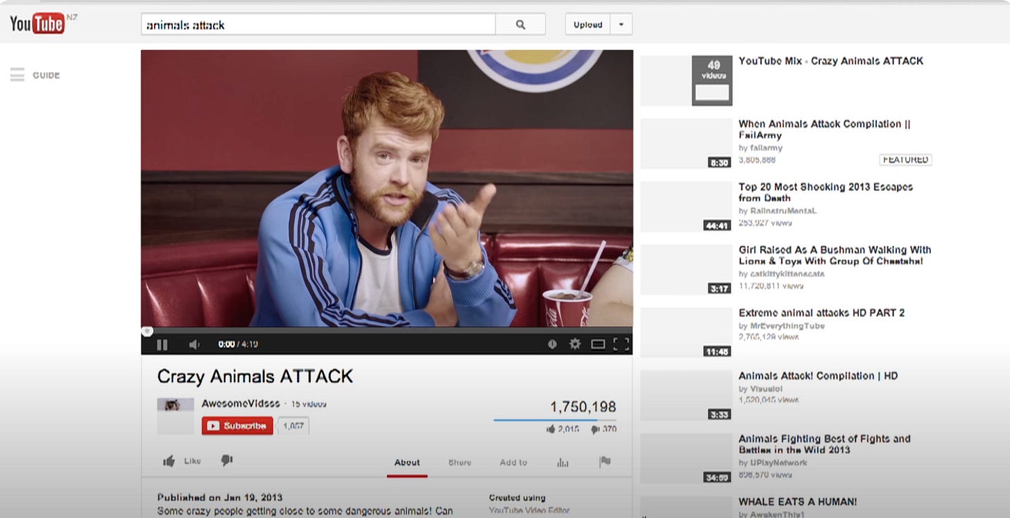
At the extreme end2, BBDO filmed 64 separate Burger King advertisements to run before YouTube videos. They targeted the most popular videos. It’s jarring to have a ad talk about your specific intent in an ad—in this case, the intent to watch an animal video—maybe jarring enough to keep you engaged.
The “Sell Like Crazy” YouTube Ad
The ad takes a laser-focused approach, tailoring its message to a particular audience, ensuring that every word spoken or displayed strikes a chord with the viewers.
The opening isn’t just a generic businessman struggling—it’s a church with the ‘gods’ of social media on religious icons. The first character opens with “They said I just needed a new logo and some more exposure, and everything would be alright”
That’s a specific and relatable complaint small and medium businesses have as they grow their marketing arms.
The script is not just informative; it's a carefully crafted piece that sells not just a product but an outcome—reducing your hours, increasing sales, looking good at your job—that the audience desires.
Beyond the script, the ad is crammed with sound effects, changing tempos, constant motion, and colorful background sets. It would be over the top if it weren’t so effective.
Then the website
The call to action from this ad is to move to a second channel—the website.
Upon redirecting viewers to the website, the selling continues its brilliance. Headings are strategically employed—longer than many are accustomed to, but each with a goal to fill—guiding visitors through the rest of the text.
The author doesn’t shy away from long copy, but a few techniques make it effective instead of overwhelming
There are Tons of Calls to Action
“I don’t want to ask for the sale too many times. That's annoying”
—someone who isn’t closing the sale
A staggering fourteen—FOURTEEN—calls to action strategically pepper the website, each designed to guide the visitor toward conversion. This abundance of prompts ensures that no potential lead is left untapped.

Readers can get off the train at any time, but by having regular CTAs throughout the copy, the webpage nudges users towards purchase.
The ad doesn't just blast words either. It embraces a variety of presentation styles on the website, so that each section is a digestible chunk of information.
Your writing should always be easier to read than skip
—Victor Schwab
Sections adorned with different colors break the monotony, making the page visually appealing and easy to navigate.
Shorter text columns keep the page light and airy.
It Has Lots of Convincing Info
Beyond just easy to read, the text has an argument to overcome almost any objection.
The text isn’t just copious; it's purposeful.
With a whopping 13,000 words—almost 40 minutes of reading—every sentence serves a distinct role in the persuasive arsenal.
The long copy could be annoying if one were forced to read it before the CTA, but the page is structures so that you can ‘get off the train’ and convert at almost any time.
The Page Uses ‘Social Proof’
Client logos strategically placed on the page serve as potent social proof, establishing trust and credibility.
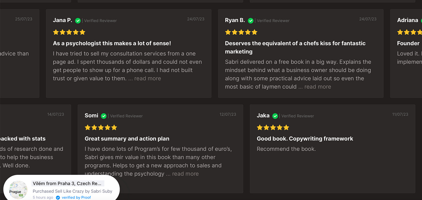
Reviews from satisfied customers further validate the product or service, creating a compelling narrative that resonates with potential buyers.’
Bubbles in the bottom corner popping up to show you that other people are buying the book act as social proof that if you buy the product, you aren’t alone.
Incorporating guarantees further solidifies the proposition, alleviating any reservations potential customers may have.
Conclusion
The video/website combo becomes a 1-2 punch of persuasion, combining elements of trust, entertainment, and clarity.
This hard-sell approach, when executed well, transforms a mere advertisement into a persuasive force.
I won’t soon be forgetting how effective the multi-channel approach was on me.
..On second thought, maybe I do need to buy that book.
Not necessarily interesting, but important!
Extreme historically—with generative AI advances, creating one-off personalized content will get much easier.


![Untitled.mp4 [video-to-gif output image] Untitled.mp4 [video-to-gif output image]](https://substackcdn.com/image/fetch/$s_!iDU-!,w_1456,c_limit,f_auto,q_auto:good,fl_lossy/https%3A%2F%2Fsubstack-post-media.s3.amazonaws.com%2Fpublic%2Fimages%2F9949ed92-4b12-4603-bd62-0c782868cb6d_600x338.gif)
